Ethan G M Green
“I want to convey nostalgia and optimism through Graphic Design, by demonstrating the use of various media to create a single work. I collect inspiration from vintage advertisements, packaging, and logos, while incorporating nature photography and illustration to emphasize my skills in traditional media. The principles of my work are defined by modernism, geometric forms, and bold color palettes to convey elements of design in the 20th Century. My style represents the connection between past and future, or vintage and modern, while honoring the influence of historic design practices.”
Corporate Branding
-
![An image of The Cultural Center.]()
Sammy's Antique Furniture
-
![An image of Greenspacing.]()
Tiny Trains Baby Apparel
-
![An image of The Float House]()
Eternal Luxury Cosmetics
-
![]()
Falcon Express Shipping
-
![]()
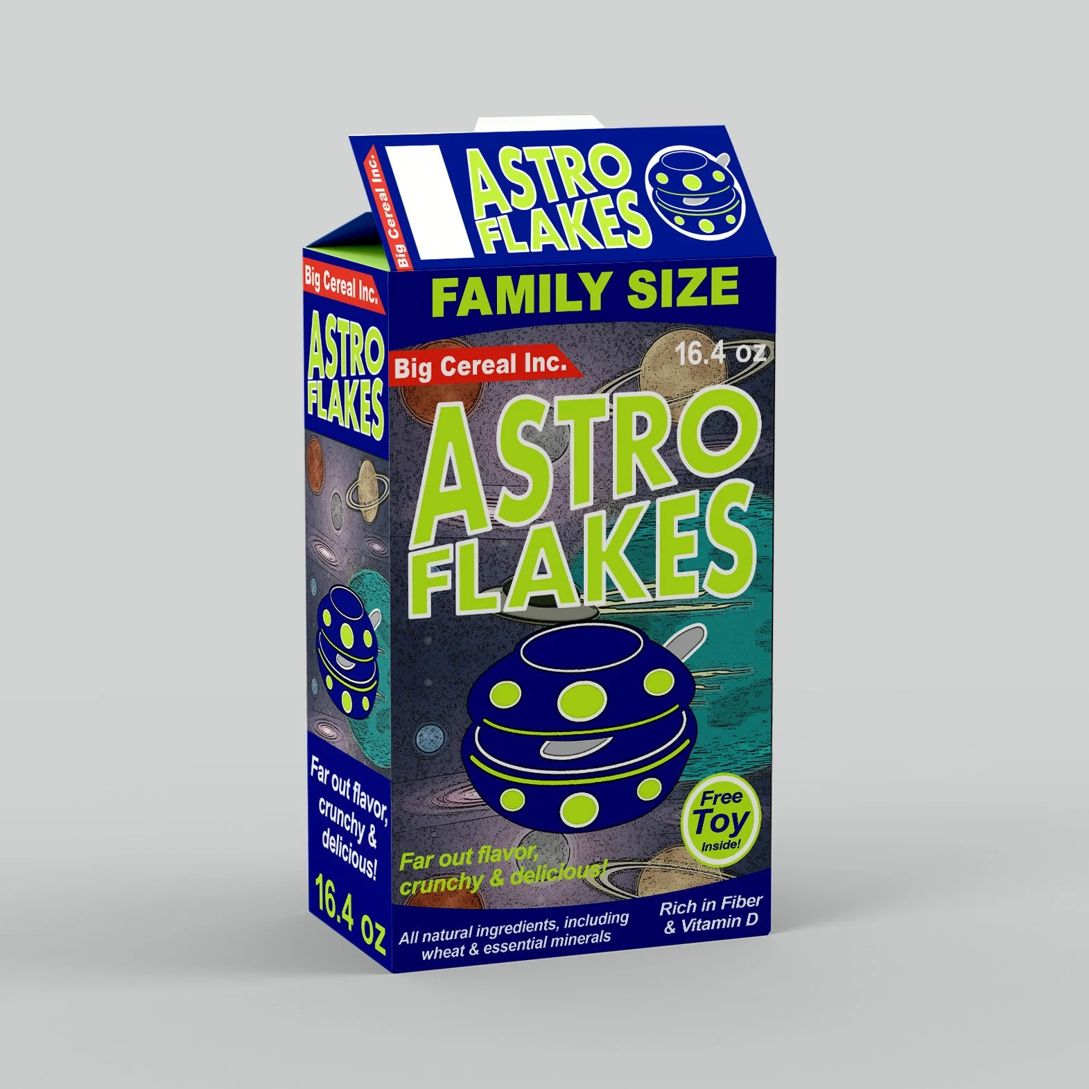
Astro Flakes Cereal
-
![]()
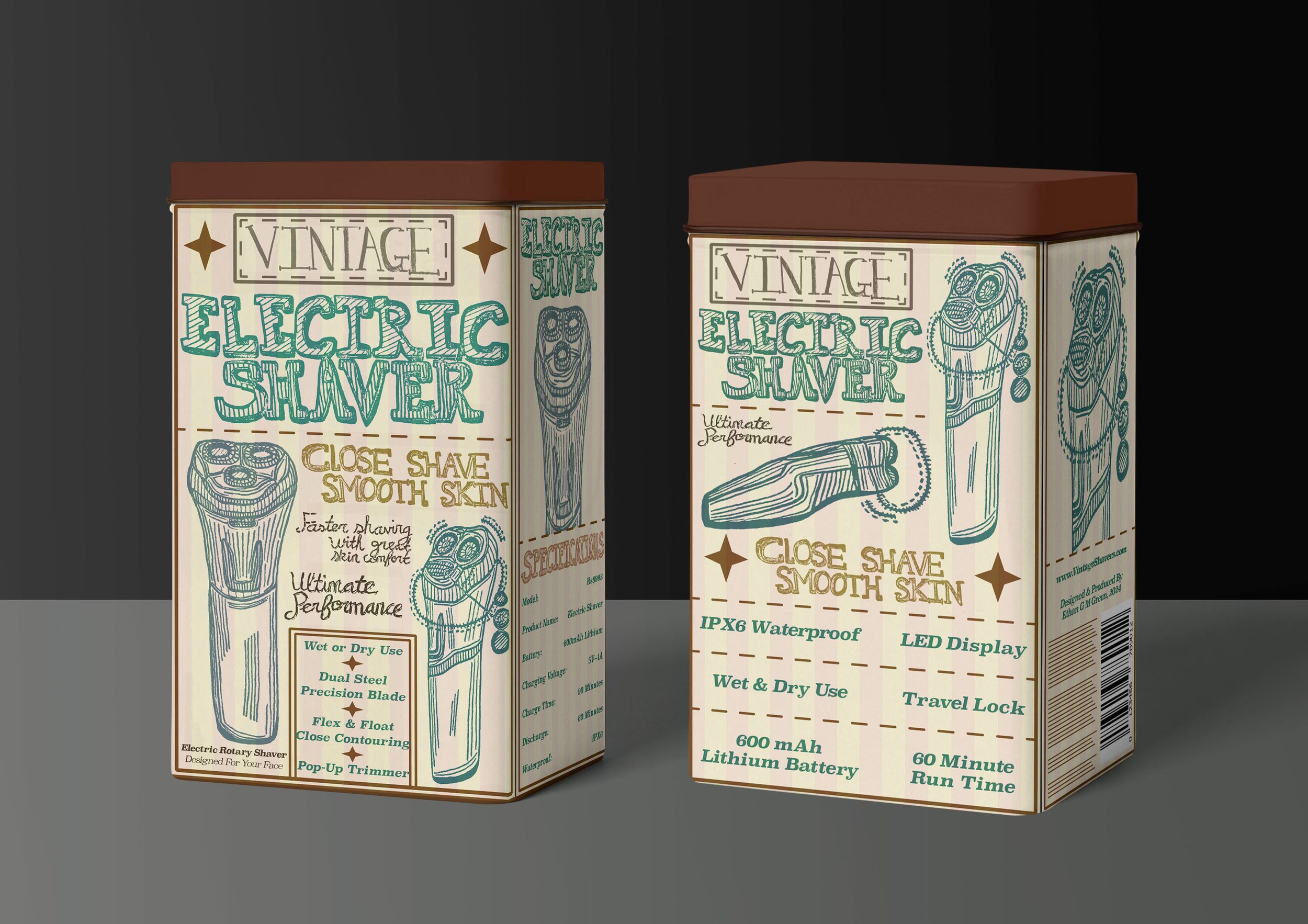
Vintage Electric Shaver
-
![]()
Groovy Time Playing Cards
-
![]()
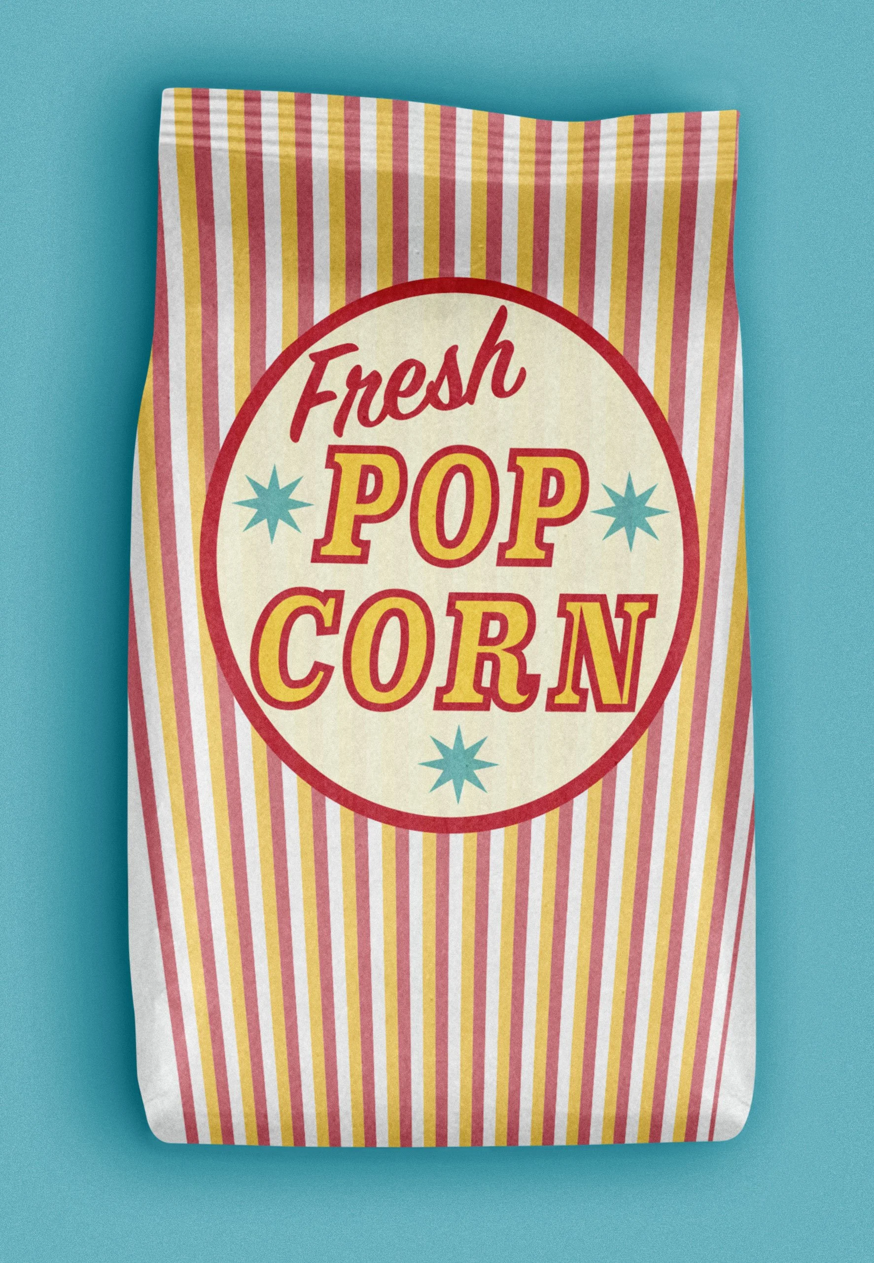
Circus Popcorn


Sofra Daima Halal Cuisine
Responsive Logo
Designed for an authentic Middle Eastern restaurant in Philadelphia, this logo honors traditional Arabian culture and architectural landmarks. There is a combination of warm desert hues, complimented by contrasting cool tones in the iconography. The brandmark depicts a royal Arabian palace, complete with rounded domes and decorative spires. This design is comprised of different systems, in which the primary logo is suited for large signage or packaging. The secondary logo is designed for website headers or restaurant apparel that reflects the owner’s Islamic heritage.
Packaging & Collateral
The packaging consists of takeout bags, cardboard boxes, and containers, depending on their intended purpose. Paper bags are available in different sizes for transporting an entire meal. The multipurpose container can be used for beverages, side orders, or rice. The flat cardboard box is for entrees or large combo platters.
Case Studies


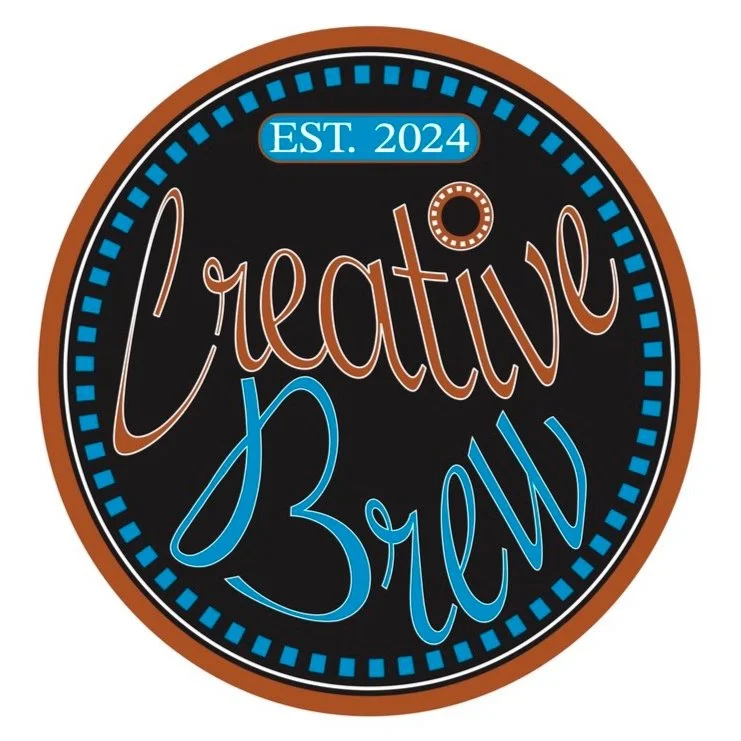
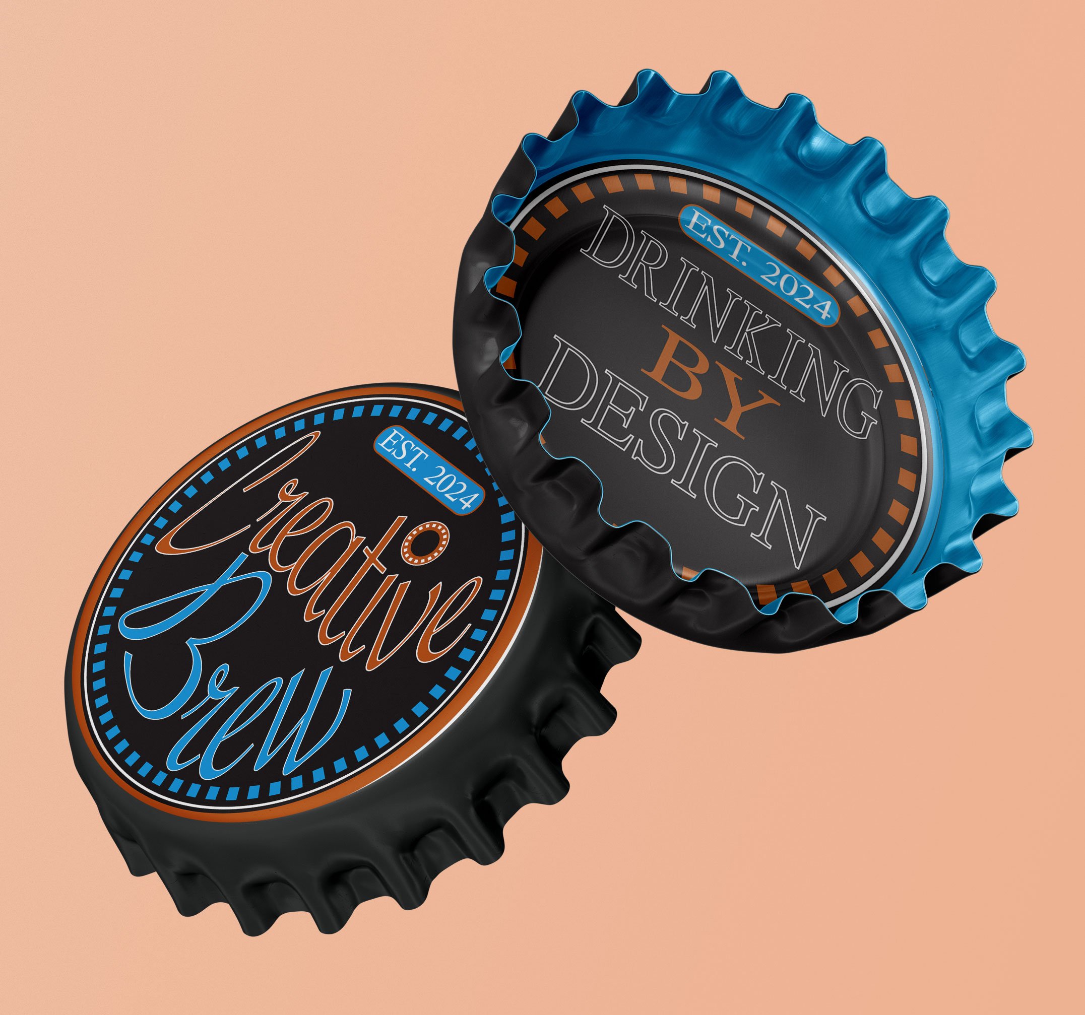
Creative Brewery
This company specializes in locally crafted beer, while providing bold flavors and style to a youthful urban population. The logo is designed in an emblem fashion, and concepts for metal signage and neon lighting were also considered. The branding is highly versatile, ranging from bottle caps to expensive glassware. The company slogan and iconography are depicted on each piece of collateral, including facts about the ingredients, preparation, or personal notes from the founder.


Lidl Rebranding
This German supermarket chain was in desperate need of a newly redesigned and modernized logo. The rebranding was intended to honor this company’s heritage by using colors from the German flag and a modern Bauhaus design style. This new logo is no longer characteristic of blocky letterforms and juvenile colors, which the original design was criticized for. The modern version evokes a professional and more updated appearance, while displaying well on building facades or grocery bags.
Original
Rebrand